
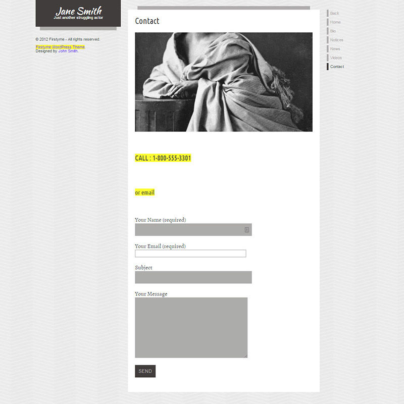
Actor website sin · #-9 of 31
Thou shalt not lose thy head
Here's the last example from this particular competitor. The image that is cropped improperly with the head cut off demonstrating that you will be beheaded after you get that website. The sidebar looks empty and makes the page look unbalanced. Uneven contact form fields help make everything unbalanced by alternating in width. Some fields are white, some dark gray. Disabled fields? Can I not contact you? Fine then.
This one is handled for you already.
Web For Actors builds the site, imports your credits, headshots and reels, and keeps them current. About 76 seconds, and it starts free.
Build mine free→